Archive for the ‘journal’ Category

Chewing on Brushes

Sunday, August 24th, 2014

Having had a chance to play with Painter 2015 for a week, I think I can talk a little more about how it’s working out for me.

It would seem having to redo the settings on my brushes isn’t enough anymore. I’ve found that a couple of the subtools I’ve relied on over the years are no longer adequate for the things I need to do.

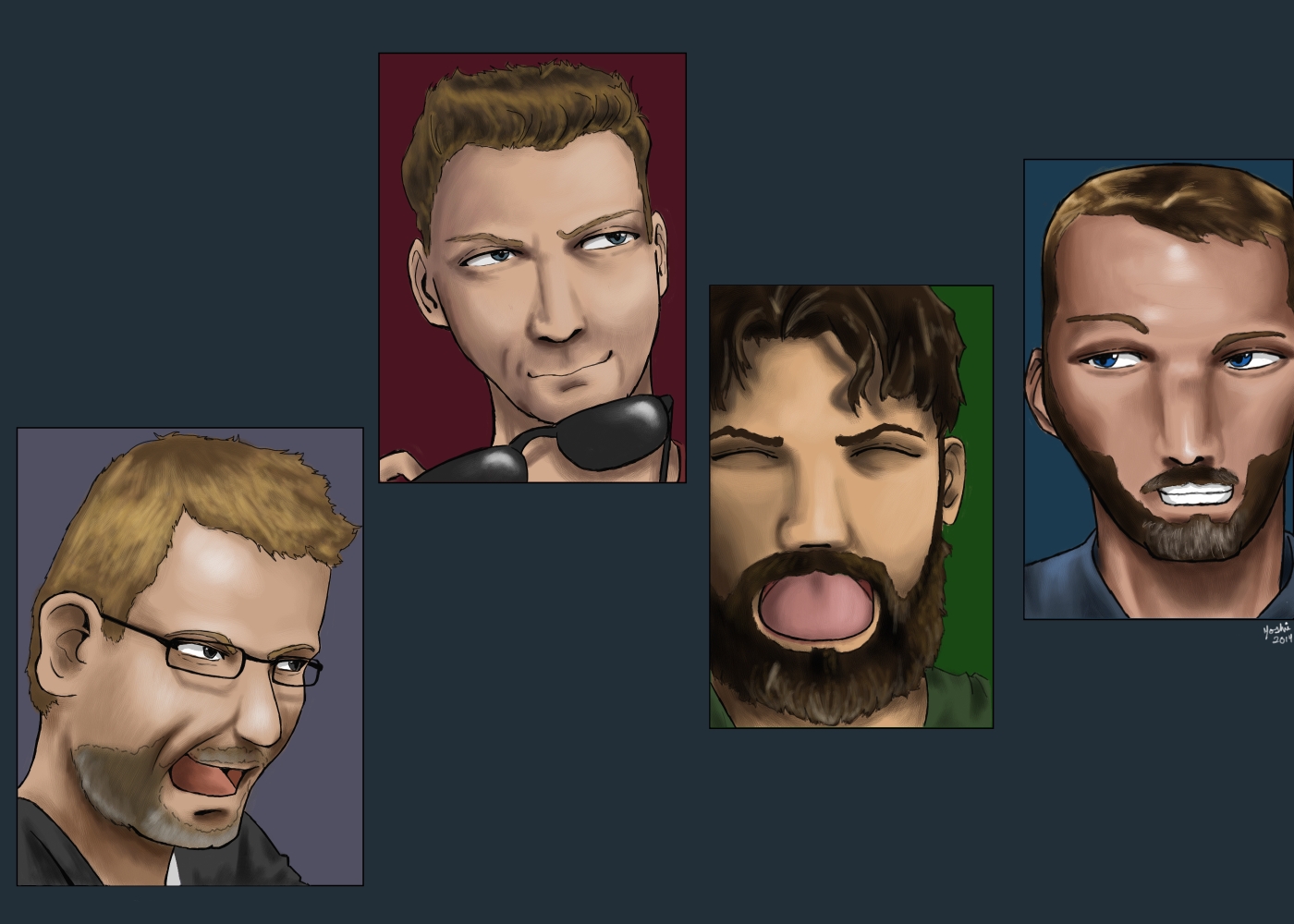
First, the Cover Pencil, which has been my go-to for any kind of line work, is being retired (as a line work subtool anyway). Even if I boost the size, I’m just not getting the solid-but-just-soft-enough line quality without having to go back over the same line several times over, not without getting these little knots and blips along the way that I have to go shave off later. It’s like a piece of yarn that gets the best sex pills for men and tufts because of friction. This is something that’s been happening since 12, although there it was slightly less of a problem, but the 2015 update more or less forced the issue.

I found, entirely by experimentation, that the Acrylic Opaque Detail Brush 3 works much, MUCH better for laying down lines (in addition to its existing role as laying down flat medium colors in small spaces). At normal pressure, I’m getting the line quality I need at just the right opacity, and if I can’t nail it the first time, I only have to make at most two additional passes, and I don’t have to resort to short strokes as I did with the Cover Pencil. And while I previously thought I was okay with having to press harder to get the opacity I wanted… I like this method much better!

I’ll keep the Cover Pencil around for the super-fine details (like individual beard hairs or tiny highlights on small objects), but it looks like the Acrylic Detail Brush will get top billing at the line art phase from hereon.

Next, the Acrylic Drybrush sets. This is where it gets a little complicated. The drybrush subtools have been my staples for nearly all of my blending because that’s how I worked with real paints and it transferred well to digital. I liked the drybrush also because it left a sort of “indicator” that while this was digital, a human hand controlled the stylus. Something about the drybrush’s mark feels “imperfect” in an endearing way.

Unfortunately, the 2015 update altered the drybrush set in a way that reduces their appeal to me in that regard. They’re still very useful for blending, but I’m just not seeing much of the bristly-brushiness anymore. I’ll need to dig through the Acyrlics subtool list (or perhaps other painterly brushes) to find something similar. I liked that effect!

Overall, I’ve noticed I’ve had to use the next brush size up, sometimes even two sizes up, to get a sufficient stroke size. This is, again, the end result of enhanced pressure level control.

In other news, I guess tonight I’ll find out whether or not my Diamond Time post gets read on Night Attack. It’s basically a plug for my portfolio (and commissions!). Since I recently did that painting, I’d like to think I’m a shoo-in, but I don’t want to jump to conclusions.

(Instant Ramen Sketchbook) Attack of the Night Frogs wearing Pants

Wednesday, August 20th, 2014

EFFADOG! WOO!

from left: Scott Johnson, Brian Brushwood, Justin Robert Young, Tom Merritt

So the Painter 2015 update dropped literally in the middle of this painting, which kinda put things back a bit. What else set me back? Oh, losing two hours worth of work yesterday, when I was doing final cleanup on this thing! I am normally super-diligent about saving, but I guess I was a bit lax because I was near the end. The price of my arrogance is that not only did I have to restart from having two of the face panels painted, I missed a chance to possibly get this mentioned on the Morning Stream. D’oh!

This turned out to be more of a collection of face studies rather than a full-blown epic scene, but… Painter update. New software kinda demands I ratchet back a bit until I feel like I got a grip on things… but that didn’t take long.

With this done, I can now open back up for Gourmet Ramen commissions! I may nibble on some other things on the side, but I am at your beck and call. Click that Gourmet Ramen link there to see the details and pricing!

Painter 2015 is the New Hotness

Thursday, August 14th, 2014

yes I know it’s just a commercial and not so much a tech demo, I needed post dressing! Also that music is CATCHY. :P

The new version of Corel Painter is out and, people, it is GLORIOUS. To name a couple things: Particle Brushes (awesome if you like adding magical sparkles and the FX subtools were JUST NOT ENOUGH) and Enhanced Brush Controls (awesome if you’re a hardcore control freak and want to fine-tune the ever-loving crap out of your brushes… or if you’re a Photoshop user, because NUMBERS). There are many others, but those are the big two for me. The latter is sort of a double-edged sword at first because if you’re like me and have a custom toolbox of hotkeyed brushes from a previous version, you’re going to have to spend a little time out of the gate “fixing” them by playing with the settings to get them back to the way you’re used to. Also, expect to press down a LOT harder on that stylus because of increased tablet sensitivity. Other than that, Painter 2015 is just MADE. OF. AWESOME.

(Seriously. I used to push 12 as the best version– I never used X3– but I wholeheartedly endorse 2015, even if you have to do a lot of fine-tuning out of the box. It’s worth it.)

BUT WAIT. There is MORE?!

Okay, remember how for the longest time I bitched about how aside from Sketchbook Pro, there aren’t any drawing apps for Android (specifically, the ones that have Wacom digitizers) that could hold a candle to Painter? That Corel needed to step the hell up and make Painter for Android? GUESS WHAT THEY JUST DID.

Yes. That’s right. Painter Mobile for Android. It is officially a Thing.

Mind you, it’s not a full-blown replica of the “big” Painter experience, but in terms of being able to start a piece in Something Painter-Like and being able to literally Send To Painter (after configuring a service in Painter itself to allow transferring) for the meat-and-potatoes detail work, this app certainly delivers. The app is free and competent for low/medium-resolution starter work, but really, just plunk down the $5 to unlock everything– increased resolution, a lot more brushes and PSD export support. While Send To Painter is awesomepants in and of itself, I would still like to see Dropbox support (both saving to AND loading from) and a “frequently used brushes” toolbar in future updates.

You’re already heroes, Corel. Just keep going in this direction and you’ll be freaking titans.

Artist Problems: Trust The Brush

Sunday, August 10th, 2014

So I’m doing the line art for the Night Attack painting (which may actually be a crossover with Frogpants since for lulz and awesome I’m throwing Scott Johnson in there) and I have one of those Anemic Line Art moments.

An “Anemic Line Art” moment is when the line art is technically sound, but just feels really barebones and weak (hence, “anemic”). You know that once you move onto the color phase, it will look SO MUCH BETTER because the hues, values and blending will bring out the details that line art just can’t accomplish with the necessary subtlety– soft folds in fabric, shallow face dimples and beard stubble, to name a few– but the lack of details in the line art still bother you. The really annoying part is that the obvious solution (going into add more details in the line art layer) is counterproductive as they would be overkill. You wouldn’t want to outline every single wrinkle in a shirt, it would be too distracting in the finished composition and take focus away from where it ought to be.

When painting people, I encounter this often when painting middle-aged faces and long pants/skirts with few hard folds or other strongly-defined surface details. In the case of the former, they have some wrinkles (often on the forehead) that are visible, but to render them with line art would be overkill because said wrinkles are relatively shallow. You’re better off holding off until the color phase and using a soft detail brush. As for the second, unless the pant legs are bent, they’re not going to have a lot of hard wrinkles. You can sort of get away with suggesting the softer folds with a faintly-drawn seam, but it’s still more worthwhile to wait until the color phase and relying on carefully-placed shadows/highlights and blending to sell it.

The absolute worst case I’ve encountered so far is with animals, birds and dogs having especially terrible line art compatibility. It’s at the point that I just bypass the line art phase entirely because the “anemic” factor is just that aggravating. See, with animals, there are SO many surface details that would just be distracting if given solid line art boundaries– feather layers and skin folds, DEFINITELY skin folds when it comes to bulldogs– that it’s just better to not even bother with it. If you still need to establish anything resembling hard boundaries at the end, it’s best to do it with foreshortening via lots of blending and soft detail brushes.

In a way, this Anemic Line Art issue led to the recent “LOL INCREASED ATTENTION TO DETAIL” look as seen in the bulldog and Law and Order paintings. This kind of puts me in a bit of a conundrum where I have to be mindful of whether or not such detail levels are appropriate for a specific composition. Being photorealistic is nice and all, but I am still primarily an “anime-like” artist. Fortunately by that definition I don’t need to use photographic reference, so it’s less tempting to try to replicate every single detail.

Artist problems! Who DOESN’T have them?

(Instant Ramen Sketchbook) Law and Order: The Animation

Friday, August 1st, 2014

Why does this not exist in real life?

In the digital painting scene, the artwork is represented by two separate yet equally important groups: the lines that establish shape and boundaries, and the colors that give life to the composition. These are their stories… *chunk chunk*

Yep. I went for glory and painted the rest of it last night. ALL OF LAST NIGHT.

There isn’t anything more to say about this, except I really didn’t need to get the idea for a future painting, to stick Ice T in the MGS1-type Sneaking Suit. Because you know he’d look pretty badass in that. Perhaps if there’s any downtime while waiting for Gourmet Ramen takers, I might do that…

I’ll figure out something for Night Attack later. I haven’t even gone to bed yet.